

industrial Engineering, Pitch time is a ratio of total SAM of garment and
number of operations to be set for the style. Or
Time = Garment SAM/No. of operations.
production target for the line.
Pitch diagram:
A
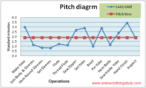
graphical presentation of individual operation’s time (SAM) and pitch time on a
same chart is called pitch diagram. For example see the following chart
(Fig.1). At this chart on X-axis operations name and on Y-axis time value is
depicted. The blue line is showing individual operation SAM and red line is
showing pitch time.
Fig.1: Pitch Diagram (SAM Vs Pitch Time)
Usage of Pitch
Diagram:
operation.
line. Pitch diagram is made on operator’s production capacity per hour and
target quantity per hour in pieces for easy understanding.
How to make a Pitch
Diagram
target collect information as following. First conduct a capacity study for all operators and find out how
many pieces operators are making at each operation. Where more than one
operator is doing same operation, sum up their capacity for that particular
operation. With the capacity study data make one table on spreadsheet as
following table-1.
are listed in column B as per operation sequence (all operations are not taken).
In column C number of pieces is listed according to the operations that can be produced
by the operators. Add one more column ‘D’ and write target quantity (in the
example -27) against each operation.
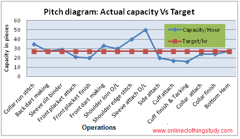
So to meet the target at the end of the line you should get minimum 27 pieces
per hour from each operation and for the preparatory operations capacity should
be more than 27 pieces. Now draw a line chart with capacity and line target
(Fig. 2). This chart is also called as “Pitch Diagram”. The blue line is
showing actual capacity at each operation and Red line is presenting the target
quantity.
In the chart, the blue line moves up and down. Where blue line is below the target line, you will get pieces which are less than target quantity. These operations are the potential bottleneck for the line. On the other way, where blue is top of the target line, it means operators have potential to produce more pieces on those operations if they are provided work. From the Pitch diagram, it is easy to understand which operations are bottleneck and where operator’s full capacity is not being utilized.
Table-1: Data shown in the following table and chart are assumed only for example. Follow above steps and make your own “Pitch diagram” with real data of a line.
|
A
|
B
|
C
|
D
|
|
Sl. No.
|
Operations
|
Capacity/Hour
(Pieces)
|
Target/hr
(Pieces)
|
|
1
|
Collar run stitch
|
35
|
27
|
|
2
|
Back dart making
|
27
|
27
|
|
3
|
Sleeve slit binder
|
29
|
27
|
|
4
|
Front placket attach
|
21
|
27
|
|
5
|
Front placket finish
|
20
|
27
|
|
6
|
Front dart making
|
33
|
27
|
|
7
|
Shoulder Join O/L
|
30
|
27
|
|
8
|
Shoulder edge stitch
|
40
|
27
|
|
9
|
Sleeve attach O/L
|
50
|
27
|
|
10
|
Side attach
|
20
|
27
|
|
11
|
Cuff attach
|
17
|
27
|
|
12
|
Cuff finish & Tacking
|
16
|
27
|
|
13
|
Collar attach
|
24
|
27
|
|
14
|
Collar finish
|
24
|
27
|
|
15
|
Bottom Hem
|
27
|
27
|
Fig. 2: Pitch Diagram (Actual capacity Vs Target quantity)
Related Topics:









Leave a Reply